Thursday, 19 May 2022

Teen Vogue content page research


Large lettering font in bold, thick typography right at the top of the page both the month and year in a  heading both in different fonts. In black for effect as it stands out from the lighter shades. Goes through a thin black line at the top also creating a margin. Same effect at the bottom. Framing the page.

Thin capital lettering underneath the date, much smaller, but in line with the banner down the side of the page, is very simple spelling the word "Fashion".

Vertical "teen vogue" is presented in a baby blue colour, with the original vogue lettering and style with the the teen being bolder and thicker lettering, in lower case. Different from vogue but same colour, similar and difference. Its behind some of the black lettering making it subtle. I like the style of this and could use it in my own content page by just replacing the words with content. This gives an overall softer, relaxing feel to the magazine.

Same blue colour but slightly darker has been used to circle some of the numbers on the content page. This is done in a scribble style like when you circle things you want in a magazine. Making more of a random scruffy style. Like this idea and could use in my own.


Same thin black line at the very side of the page to match the top and bottom linking them together so that there not separate.

The numbers for the content page are in a simple bold style with the emphasis of the circle around them only on some of them. The same bold, simple style is also used for the subtitles for the stories. This makes them easy to read. The stories are also not cramped into one space. I like the fact that that it's not cramped as it's simple but effective. These types of stories as well can be used for my own magazine because its made for a younger audience. Like "Trending" and "The New Normal".

The stories in the magazine are not divided into different sections like the others. But it does feature and tells you which ones are on the front cover of the magazine with a simple box with the words on the cover next to the number. I like this idea so that when people do want to read more on the stories they've briefly seen then they can go straight too them.
This is the only photo on this content page which is unusual as many of them have more then one to make the content page more interesting whilst matching this the stories they've written. 

It still matches with the soft pastel colours of the page with the light beige background. And the white pureness of the white top.

The expression on the models face is happy and playful making the audience smile with her. She has a very relaxed and shy pose with her hands slightly over her face, making the magazine as a whole a lot less serious. The fact that her hair is down and care free as adds to the image with also minimal makeup done representing a more natural, casual, everyday person.

The image is captioned with the words "p.120 Global Citizen" linking nicely with the picture on things that have been going on in the world. Creating an environmental link, making it the biggest issue for the magazine. I like the feel and vibe the picture gives of to the audience as it doesn't feel like it was staged at all. I also like the fact that its a medium shot as it works well for the pose that she's doing. I don't like the fact that the font is the same all through the content page. I would of made the caption not bold and in a different font to break it up a bit. 

At the very bottom of the page in the right hand corner there is a link to their website to expand on their stories even more. It also creates a wider audience as people are now more likely to look on the website first then buy the magazine itself. I like the idea of this  and where the placement is because its in the corner then that is where people are gong to pace their fingers when they want to turn the page over so it could easily catch their eye. But I would definitely make this loads bigger then it is because people are more likely to see it instead of it hiding away and potentially covering it up.

Overall the magazine has a very soft aesthetic to it. Simple text and design keeping with the original Vogue which was aimed at older richer women until now expanding their audience to a younger audience whilst making it less feminine evolving with the times.

Content pages research


Thursday, 24 March 2022

Final masthead

 Ke Ola!-  I got the title of my masthead from looking up life in different languages. I choose Ke Ola! as its the Hawaiian meaning for life, linking into the specification of a lifestyle magazine. This is very tropical and can link to the idea of travel, reaching the age gap of my target audience 16-25 year olds. Everyone has places that they want to go to abroad, at any age, making it also inclusive. This could link to the aspirational audience by having a luxury lifestyle spending time abroad. You would expect to see stories about travel. This magazine title suggests that there will be stories about travel, clothing, tips and tricks to do with travel, food and health. Also, what's new and going on in the world. 

I want the font of on the cover of my magazine to be simple so that its easy to read and slightly big so that it can be read from far away. Most of the magazine will have to stick to at least 3 colours but I also want to have subtle hints/ nod to Hawaii with the colours. I could do with by adding boarders around the images or text to add a pop of colour on the page, this will link into the conventions of the magazines with the bright colours. With the masthead I want to include a symbol so that the magazine will become recognisable like a Hawaiian flower.  

Thursday, 17 March 2022

Masthead ideas

Chic la vie - My first idea was Live it! but this was taken by an American company. So that led me onto finding the synonyms. Chic is a link to style by researching synonyms for it, then la vie is life in French, all linking to lifestyle. Most of the magazines have French in them to make it more sophisticated, more cultural. Lifestyle is part of the name. Chic meaning smart elegance.  

La Vida Chic

Ke Ola!


Thursday, 10 March 2022

Magazine Front Cover


Masthead keeping in with the rule of 3 whit grey and black.

The word British is presented in the masthead to say the audience that it is promoting British values being a British magazine.

"exclusive" Telling the audience that you will never find this anywhere else.

The text is surrounding the Celebrity and not covering him up creating the main focus. The preferred reader is someone who is a fan of Michael B Jorden and the Black Panther movie.

The use of "your" makes it more personal for the audience creating direct address.

mise en scene= The cover image for this magazine is a close up of a well know actor. He is well known through his sport career then switching to acting. Because he is American it links British and America together. He is represented through his clothes are chic and classy with the barea on his head but then cool and collected with his leather jacket on. The celebrity is looking straight at the camera with his body slightly turned away from it, creating direct mode of address. This creates a confident pose/posture.

There is a call to action with the website being under the cover line to find out more information. 

"Rise Up" is in a bigger font then the rest as it encourages the audience motivating them. this is serif typography. 

The background is plain and simple keeping with the theme of the magazine. The lighting is very dim of the actor to keep the darkness of everything else. 

This magazine gives credit to the people that write the separate stories.


Tuesday, 8 March 2022

NEA Brief 2023

Overall I find the brief quite challenging and overwhelming. Reading it felt daunting to me thinking that it's quite a lot.

Quite a lot of the briefs revolve around lifestyle. Lifestyle to me is who people live there life, from food to sports to clothes ect. Everything that people get involved in.
  

Brief no.1: Television and Online 

For this brief you have to  have a 3 minute opening sequence of a new lifestyle programme for Channel. I find this very challenging as I can't think of one lifestyle programme that is on TV at the moment.  

None of the program below are great but they don't meet the specific target audience for the brief. It wouldn't be anything interesting for 16-25 year olds, with it being such a huge age gap. People who are 25 probably don't like the same things as a 16 year old as they are in different stags of their lives. These types of programs are aimed at an older audience. This rules out brief one for the one that I want to do.

Brief no.2: Radio and Online

For this brief you have to create a 3 minute opening sequence of a new celebrity interview programme for a local commercial radio. I thought that this would be very hard to to the fact that you would have to get someone who can act like a celebrity but then still have two other people to interview the celebrity. You'd have to make up the celebrity as well, whilst providing a audience hook and interaction. 

When I looked up if there was any celebrity interview on the radio I found it hard as the ones I found were all BBC which is not a commercial radio. Although this would be better or the age gap as radio is more diverse in age. All together this rules out Radio for being my choice of brief.

Brief no.4: Music Video and Online 

For this brief you have to make a music video for an anthem, which according to the brief is a song that celebrates and inspires elation or pride. From the top of my head I couldn't think of any songs that were anthems. It makes it harder as well that the target audience is for people who are aspirational. I have found songs that are inspirational but are not necessarily anthems.
 

Thursday, 3 March 2022

Stranger Things fandom, merchandise and marketing

2017 Superbowl trailer season 2

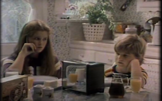
Netflix decided to start the trailer of with a homage, creating authenticity for a newer audience but  nostalgia from the older audience. This is due to Eggos becoming more popular with them using them in the show.


 Immediately the advert changes gear with this blurred effect, recreating what Will goes through with the multi-verse. This creates the suspension of disbelief. It immediately brings it into the present day.


This is part of their synergy making a recognisable brand for the series. When you see red, neon graphics people know that it links to Stranger Things. The sign of the logo is the same for the first season but with the added addition of the 2 in the background people will be more excited. This creates more fandom as people want more and are expecting more from the show, this new content with the same feel as the first season.


Throughout the trailer many thing are presented upside down creating synergy through the trailer. Branding it as their own, linking it all to the upside down world in the series.


Netflix relies on shows like this to create more money and gain popularity to keep the streaming platform going.

Thursday, 17 February 2022

Posters of Stranger Things


Season 1 

This poster gives us many clues about the season ahead.
Will and his mum look really worried in their facial expressions. It's like they've seen something disturbing and unpleasant. This created a sense of mystery.
Under his mum Nancy is holding a baseball bat, like she is using it to defend herself from something, this could be the same thing that Will's mum and brother are looking at. There could be violence.
Under Nancy is Jonathan, he has the same facial expression as his mum and brother. But he looks like he's seen something wrong that he's just taken a picture of.
There is a sense of authority with the sheriff to the right of the group. Who could be there to help, with the radio in his hand he could be calling for backup. but he doesn't have the same concerned facial expressions as everyone else.

The light shining from the bikes suggest that these characters play a significant role, with Eleven in the middle of the poster. This is suggested by the fact that the girl is much bigger compared to the character around her. Eleven also gives the sense of science fiction with the power pose she showing, like she's controlling something with her hand.
To the bottom left of the poster there is a hazmat suite, glowing which links to science, connecting to  the lab building behind. this gives us a sense of science fiction and a problem that may accrue with the lab due to the suite glowing. This also creates a sense of mystery.

This poster set the brand for Stranger Things. The uses of dark, blues and reds became iconic of Stranger things. The logo also became recognisable, giving of the sense of the neon lights, that were popular in the 80's, shing in a bright red. The alphabet, with the lights in the background was also used as a key connection to the show. all these thing were used everywhere to represent the show. Especially with the fandom that came with the character Eleven, everyone cosplayed her.

Season 3

This poster is more brighter having a lot more characters in the poster, but still gives of the sense of Eleven is still being the main character, with the same pose as the original, this could mean that she still has the power she had in the first season.
The sheriff, Will, Nancy, Johnathan and the mum are still in the poster but had been significantly shrunken down from the original. Johnathan has still got the same pose with his camera suggesting that the camera plays a key role throughout. Nancy is now holding a pad and pen becoming more mature in this season. the others still have the same facial expression as the first poster, but this time they look like they are running towards something.
We have more character like : Steve, Max, Robin, Suzie and Erica.
The plot has definitely thickened from the first season due to the new character but also from the fact that we now know about the monster that has been threatening them all. Taking up one third of the poster, making it a huge deal. This gives the season a sense of sciences fiction again. it also gives the sense of mystery as we don't know what the monsters intentions are.
includes in this poster is a lot of triangles from the sign to the characters to the monster at the bottom. The neon sign gives the poster that sense of 80's again (when it was set) keeping it on brand. it also gives a 3-D feel to it. the sign is still on the same colour scheme of blue and red.
In the background there is more going on then in the first season. The fireworks are the same colour scheme going off in the background, which are normally used for celebrations, meaning that there could be triumph in this season. 
More fun is seen in the bottom left hand corner of the poster depicting a fun fair. But this looks like this could be ruined due to the man infront with a gun in the air.

In the right hand corner there is another character, Billy. He could be trouble due to him being separate from the rest of the characters. I think that the rats are also linked to him as they are all crawling at the bottom towards him, with some even being dead on the ground. the lighting for the corner is different, in a lighter blue standing out more from the black background. this creates a sense of mystery.

Still Stranger things are keeping it on brand with there logo, with a slight twist. The lettering is more crisp and clear, it doesn't glow as much with a smaller font. to represent the third season there is a huge 3 behind the lettering still in bright red.




Thursday, 3 February 2022

Jungle Book 2016 evolving technology

 A bigger budget helped the film to advance into new more high quality technology. Using ground-breaking visual effects techniques - many of them led by UK-based company MPC - the aim of the filmmakers is to make the viewer feel for the first time that they are actually in the jungle with Mowgli, Baloo and the rest of the gang. Instead of shooting live-action, before cut-and-pasting animation on top, the filmmakers built the entire jungle within a computer, using footage from real Indian jungles for reference. Mowgli was filmed alone on a small Los Angeles soundstage and the world was then constructed around him. Once the jungle had been constructed, its animals needed to be turned into characters. Rather than applying motion-capture, they instead used the more complicated process of key-frame animation, using real animals for reference - to capture photo-realistic images of the creatures, but with the visual characteristics to express the emotions and vocal performances of the actors. The animals are not entirely realistic though. Wanting his film to reflect a childlike view of the world, many of the creatures and plants are slightly larger than their real-life counterparts, adding to the feeling that the audience is experiencing the jungle in the same way as Mowgli - as a small boy in a big world.

Creating this took over 800 artists to make more then 70 species of animals. This took a huge amount of time - because of his size and furry nature, it took artists almost five hours to create each frame of film featuring Baloo.


The History of Radio 1 Breakast show

The first breakfast show presenter was Tony Blackburn, who spoke the first words on Radio 1 and remained in the slot for nearly six years. Other DJs who have hosted the breakfast show for more than five years are former hosts Nick Grimshaw, Mike Read, Simon Mayo, and Chris Moyles. Moyles was the longest-serving Radio 1 breakfast show presenter, having hosted Radio 1's "The Chris Moyles show" for eight years from 2004 to 2012.


Tony Blackburn was the first voice on BBC Radio 1 and picked the first song to spin – The Move’s Flowers in the Rain. He started on the Pirate Station. Tony had said “There was a lot of stuff that came out of the 60s which actually wasn’t very good." “When I was on the pirate ships, being honest, we had 100 records coming in every week and if you had two really good ones out of that you were lucky. But the thing about the 60s is it was an interesting decade because so much happened within it. It was a revolution in radio certainly and I’m proud to have been a part of that.”

Nick left BBC Radio 1 in 2021, he said that he wanted to do something else as he had been at radio one for 14 years and ad interviewed everyone, twice. Nick joined the BBC in 2007 and co-presented a youth show with Annie Mac. He was made presenter of the Radio 1 Breakfast show in 2012, taking over from Chris Moyles. He stayed there for six years before swapping with Greg James and taking over the drivetime show.

He simple wants to move on.

Nick did have 10 million listeners weekly, doing 4 days a week. In 2020 it was changed to 5 days a week.

Greg James only presented the Breakfast show for 2 years, as he was then replaced by Dev and Alice Levine. Presenting the early breakfast show from October 2007, on 21 September 2009 replacing his Drivetime show. he had 4.72 million weekly listeners.


Wednesday, 10 November 2021

The Big Issue


This version of The Big Issue is indexical of Christmas. With the different decorations that are to the left hand side of the front cover, these are joyful, kind and loving times. The baubles are the same colour and shape as the circle its hanging from. This is a bumper edition of the magazine, this is due to their ethos. There is more content in this magazine because it's closer to Christmas time. This is the worst time of year for the poor, so they upped their prices to give a little more at this time of year. "A hand up not a hand out" this is their splash head. The writing on this front cover is in red and an old fashion font, representing Victorian Christmas. The writing shares with us that people are not changing and are still ashamed about how the poor are still treated. Guarnlett theory can be used on this magazine as people will be influenced by this and how themselves treat the poor and what they can do to help. " Haunts" represents how scary this situation is. Cultural symbol on this front cover is the link to Dickens who created Scrooge and the Christmas Carol. He stands for poverty and equality as he has been poor himself when he was growing up. The candle that Scrooge is holding is symbolism of warmth, hope and having the money but just keeping it for themselves.   


Will.I.AM is the main focus of this front cover. He's popular with a huge name in the music industry. Baudrillard theory is used in the picture of Will.I.am as the image is hyper realistic, it's not really him, it's just him made up off tiny little pieces. This matched with the text being made up of the same shapes. Guantlett is also represented in this cover. The sentences around his head are representing not giving up, power and having ambitions like everyone else, building him up. A symbolic sunset makes up the background. Red is the power that he has and the yellow/oranges are the warmth around him. 


This cover of The Big Issue is from the royal wedding of Prince Harry and Megan Markel, who ended up moving out from England to America. This is using Curran and Seaton's theory because this is what everyone wants to see, because it was relevant at the time. Prince Harry and Megan have been hand drawn with them representing themselves as the issue as they are dressed like the people who hand them out. Gauntlett  is used to show they look gender neutral, with huge heads meaning that the magazine is still taking the mick of the royal family. At the bottom of the cake is the ethos of the magazine. It's a really important message that you can still achieve your dreams no matter what happens to you, like Davis Tovey, who had big things going for him then having every taken away from him. He's now not given up and continued to work him way back up, with the drawing of the front cover.

Ke-Ola website and link page

Home | Ke Ola (artyfartymonkey.wixsite.com)